Se7en:
The text flickers from corner to corner and only momentarily becomes enlarged for more or less a fraction of a second and then it cuts to the next shot. We can see that the text is larger from the photo above, showing that it is the focus of the shot as the background becomes black to make the text the key image unlike the rest of the shots where there are other images flashing past as well as the smaller text accompanying it. The text is a dirty, jagged style, which could give the initial impression that the film is going to be the same, setting a tone for the rest of the film. As well as this the white contrasting with the black could suggest the binary opposition of good against evil and this could foreshadow future events as more black is on show, which could suggest that the evil prevails. We could attempt to use the edit used in this sequence as it has the text frantically jump all over the screen to give that sense of urgency and uncertainty that our film needs to evoke.
Cube:
In cube we see the original text being made up of cubes to spell out the title, this then fades into the text seen above. Much like Se7en, this title has a plain background, to make the title the key image of the shot. This shot then switches colours as the black becomes white and the white becomes black. This could show that there is binary opposition as it is black vs white, or otherwise seen as good vs bad. The fact that the colours switch could signify that the good characters will have bad within them and the bad characters will have good in them. The text fills up the entirety of the screen and is plain. We could use the text type seen within this film opening sequence, due to the fact that it isn't too complex, but also because of the cubes used, fits in well to the films title. We could attempt to do this with our films and link it to the title of the film (still undecided).
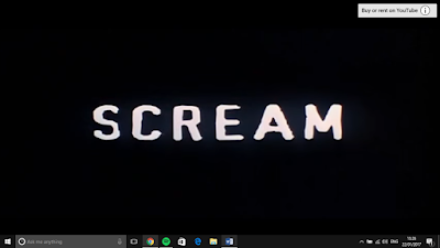
Scream:
The Scream opening sequence is simplistic and has as pulsating light, this could show a sense of urgency within the film. As well as this text is white and then fades into red after we hear a bullet and a knife's slashing. This could foreshadow future events within the film. the edit used is it zooms into the camera and disperses into the next scene, this could be used within our film to lead to the end of the opening sequence and the start of the rest of the film. As well as this we see the font which is quite small but it looks like handwriting, which is seen also in the Se7en sequence, showing us that it is popular in the horror genre and might be a good idea for us to use.


No comments:
Post a Comment